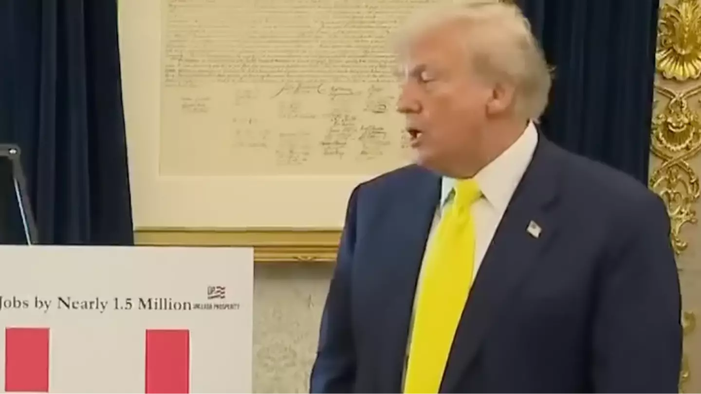
Donald Trump caught the media off guard when he invited them to the Oval Office to present some new charts, but many were puzzled by his failure to clarify their significance.
Journalists were assembled at the White House on Thursday, August 7, for an event recognizing Purple Heart recipients. However, they were unexpectedly led to the Oval Office when Trump called for a brief meeting.
The reason for this impromptu gathering was Trump’s meeting with Stephen Moore, a senior visiting fellow in economics at the Heritage Foundation, a conservative think tank, and co-author of the 2018 book “Trumponomics.”
Moore had compiled data about the U.S. economy following the release of figures by the Bureau of Labor Statistics (BLS) last week, which indicated that fewer jobs were added in July than anticipated.
In an effort to counter the report’s implications, Moore suggested that the BLS overstated the job creation numbers from the last two years of Joe Biden’s administration, a claim Trump alleged was done ‘purposely’.
Utilizing figures derived from unpublished Census Bureau data—making them difficult to independently verify—Moore collaborated on creating several charts highlighting Trump’s achievements in his second term.
Moore stated that in the initial five months of Trump’s return, “the average median household income adjusted for inflation and for the average family in America, is already up $1,174.”
Trump boasted, “That’s an incredible number. If I would have said this, nobody would have believed it.”
Trump directed reporters to a particular chart, which he claimed ‘says it better than anything’, and called it ‘pretty amazing’.
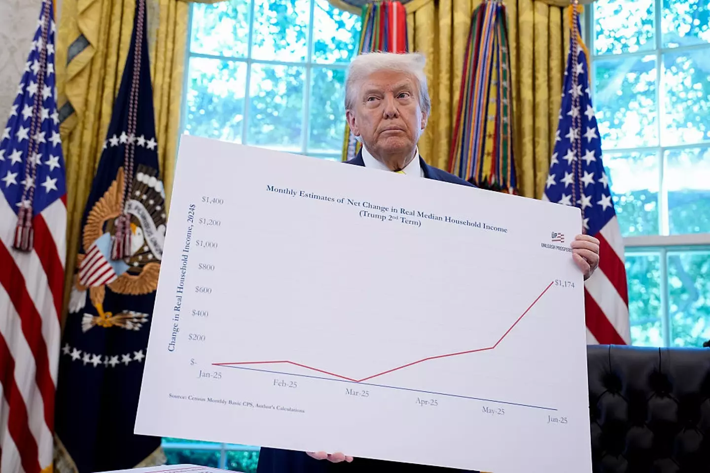
The chart displayed an upward trend line, though Trump did not provide an explanation of the data it represented.
Instead, he simply remarked: “All new numbers.”
This unusual display caught the attention of viewers who questioned, “How’s this real life?”
One viewer speculated that the scene was generated by ‘AI’, while another likened it to a comedy sketch.
Upon closer examination, the chart is identified as “Monthly Estimate of Net Change in Real Median Household Income”, showing an increase from $0 to $1,174 since January.
However, the absence of a clear explanation of the figures has left many confused, with one individual commenting, “Why did no one from the media ask him what the chart meant?”