As the world’s most anticipated night in fashion rolls around, viewers everywhere tune in to see which celebrities and style icons will ascend the Met Gala steps.
Most major awards shows and premieres rely on a classic red carpet moment, a staple of entertainment and high fashion alike. But the Met Gala has increasingly moved away from that convention, continuing its recent habit of swapping the traditional runway for something far more thematic.
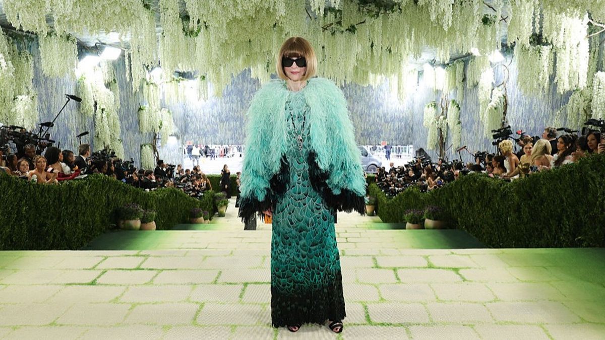
This year, the entrance surface was so carefully designed that many watching from home initially struggled to recognise it as a carpet at all. From a distance, it looked more like a stone garden path, with mossy green accents scattered across a warm, earthy base.
Adding to the dreamlike effect, the walkway was framed with real wisteria alongside trompe l’oeil elements, giving the scene added depth and an immersive, garden-inspired atmosphere.
The hand-printed pattern became its own showpiece. The concept came from designer Raul Ávila, developed in collaboration with Baz Luhrmann and award-winning set designer Derek McLane, to capture the spirit of Northern Italian gardens.
The garden motif was chosen to echo the event’s broader creative direction—linking fashion and fine art—by drawing from Renaissance-era aesthetics and the visual language of some of history’s most recognisable artworks. The goal was to set a romantic tone that felt like a living backdrop for the meeting point of art and style.
“It’s soft, it’s romantic, it says spring, “ McLane told Vogue, before adding that it gives a ‘simplicity of modernity, which I think is right for this year.’
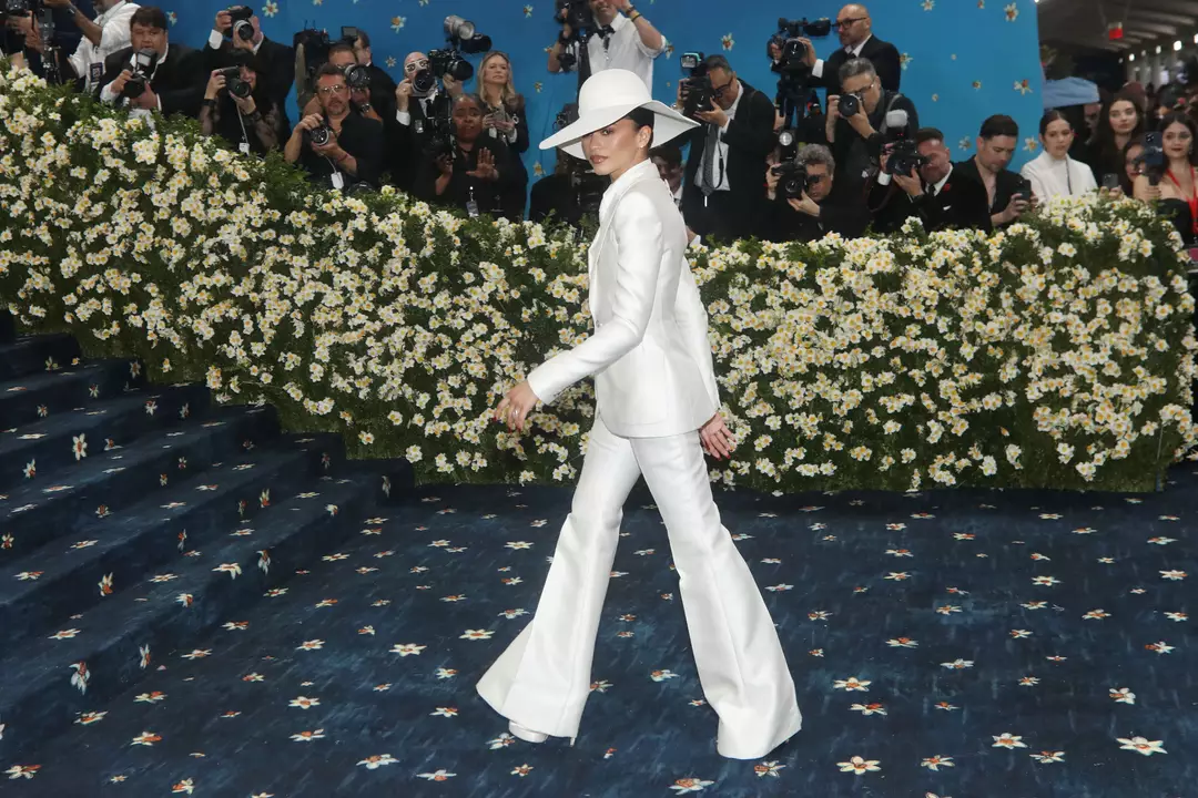
For nearly a decade now, the Met Gala’s “red carpet” has rarely been red at all. Instead, the entry design has acted as an extension of the year’s theme, shifting colours and motifs to match the exhibition and the storytelling of the night.
Last year’s carpet, for instance, was white and finished with delicate, swirling linework—an understated nod to Karl Lagerfeld: A Line of Beauty and the exhibition design itself.
What stays consistent is the intention: regardless of colour, the carpet is meant to support the fashion rather than compete with it. The design is typically kept elegant enough to highlight guests’ outfits, avoiding anything too visually loud that might distract from the looks.
The last time the event leaned into the classic red carpet aesthetic was 2015, during China: Through the Looking Glass. In that context, red felt especially fitting—closely associated with luck, power, and celebration, while also reflecting the colour’s longstanding presence in Chinese art and cultural tradition.
Over the years, attendees have delivered plenty of headline-grabbing outfits, but the event isn’t a free-for-all. Guests are given a dress code, and they’re expected to interpret it in a way that aligns with the theme.
The Met Gala also serves as the launch event for the Costume Institute’s spring exhibition, so the theme is typically tied to that showcase—paired with a dress code that leaves room for creative interpretation.
This year’s theme is ‘Costume Art’, connected to an exhibition that places paintings and sculptures in conversation with historical and contemporary clothing.
The exhibition explores ‘the centrality of the dressed body in the museum’s vast collection’.
The dress code is intentionally broad: Fashion is Art.
For many, that sort of open-ended prompt can feel even more stressful than something like “smart-casual.” British Vogue notes that it ‘encourages attendees to consider the many ways that designers use the body as their blank canvas’.
Previous themes and dress code have included:
Theme: Superfine: Tailoring Black Style
Dress code: Tailored for You
Theme: Sleeping Beauties: Reawakening Fashion
Dress code: The Garden of Time
Theme: Karl Lagerfeld: A Line of Beauty
Dress code: In honor of Karl