Many people are surprised to discover the original name of Pepsi. The popular soda was created by Caleb Bradham, a pharmacist from New Bern, North Carolina, in the early 1890s. Although nowadays more than half of soft drink consumers in the US enjoy Pepsi, according to a Statista report from last year, the beverage was initially concocted to aid digestion rather than for enjoyment.
Bradham considered naming the drink Pep Kola, a name he acquired from a local competitor, but ultimately decided on Pepsi-Cola.
You might wonder how this name relates to indigestion. Interestingly, linguists point out that “Pepsi” is derived from a Greek word meaning ‘digestion’, which aligns with the brand’s early slogan.
In 1904, Pepsi marketed itself with the slogan: ‘Exhilarating, Invigorating, Aids Digestion’.
However, this slogan came more than two decades after the drink’s creation. Initially, it was known as something quite different.
The original name was ‘Brad’s Drink’, named after its creator. Many people are still discovering this less-than-creative name even today.
One user on social media remarked, “I just learned that Pepsi was originally called Brad’s drink. So anyway, I’m going to be reeling from that for a week or so.”
Another commented, “I was today years old when I learned that.”
One person humorously noted, “Brad’s Drink sounds like the name of a 90s alt-rock album.”
On Twitter, someone recently wrote, “Hello, I just learned that Pepsi was originally called ‘Brad’s Drink’. BRAD’S DRINK.” They added, “I will only be referring to Pepsi this way from now on.”
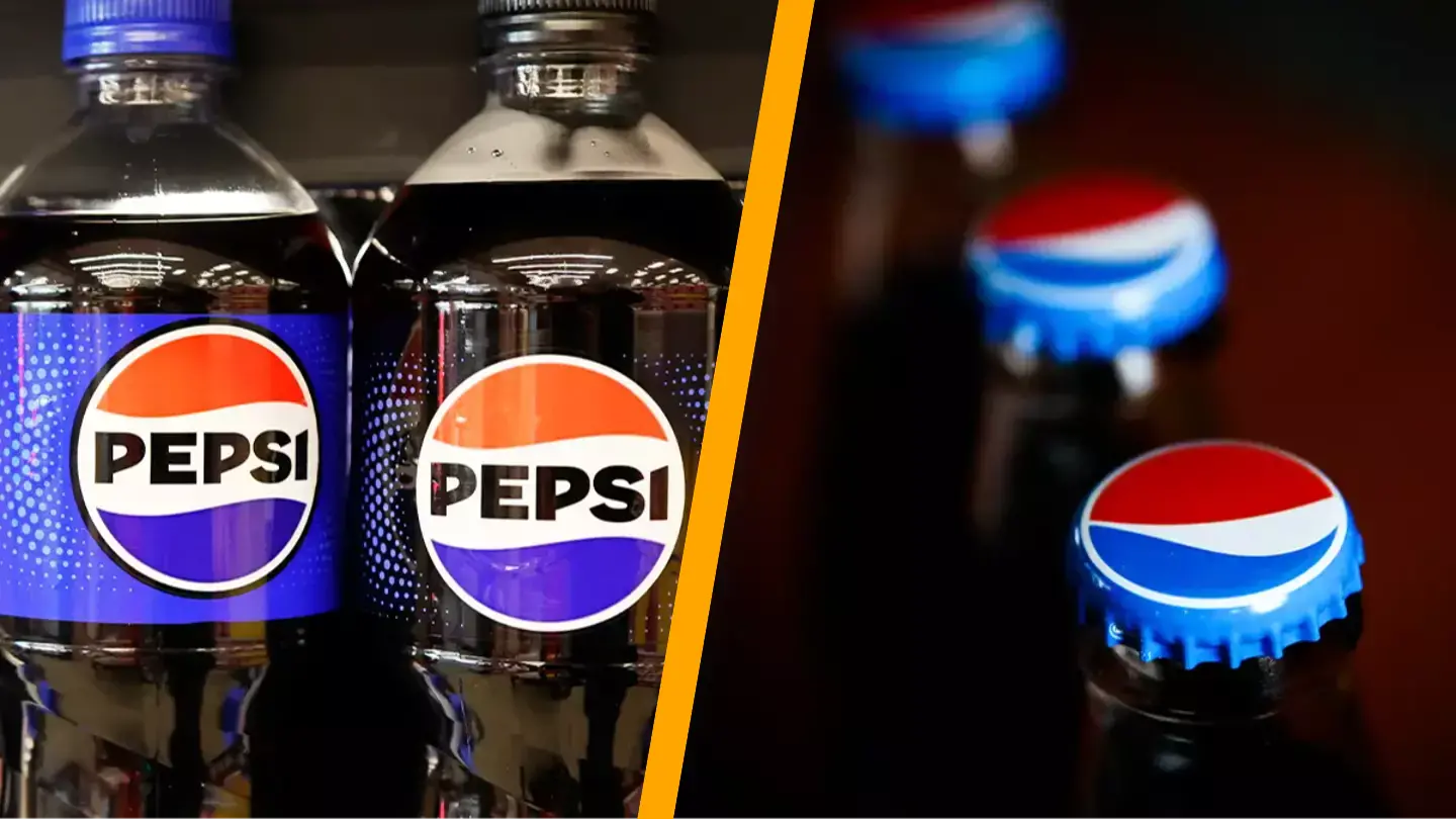
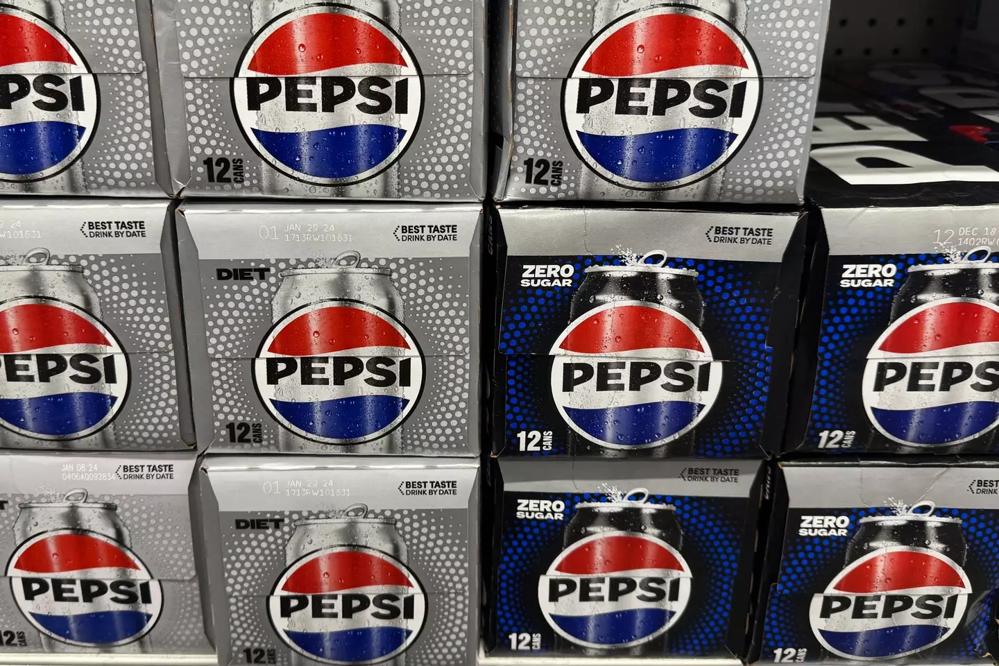
The logo of Pepsi has also seen various changes over the years, with the most recent update occurring in 2023.
One of the motivations behind the redesign was that many people couldn’t clearly recall the original Pepsi logo but recognized the red, blue, and white colors and text within a circle.
Mauro Porcini, PepsiCo’s first Chief Design Officer, told CNN, “We couldn’t ignore that kind of insight. Instead of rejecting it, we decided to embrace it.”
Todd Kaplan, Pepsi’s Chief Marketing Officer, also commented, “It’s this lowercase, italicised font, the blue is a little bit muted… it doesn’t exude that confidence and energy that the brand really represents.”
In response to feedback, the company revamped its logo to resemble the 1990s design, featuring ‘Pepsi’ in bold letters at the center of the circular blue, red, and white emblem.