Have you ever noticed the distinct red and yellow colors of the McDonald’s logo and wondered why they were chosen?
The famous golden arches, a symbol recognized worldwide, have been part of McDonald’s identity since 1961. Alongside this, the clown mascot, Ronald McDonald, debuted in 1963. However, since 2016, Ronald has become less prominent in advertising.
Interestingly, there is a psychological reason behind the choice of red and yellow for the McDonald’s logo.
Over time, experts have analyzed the logo’s appearance, noting how the combination of these colors is effective in attracting customers.
Karen Haller, who operates a behavioral design company, explains that major brands utilize bright colors to encourage consumer engagement.
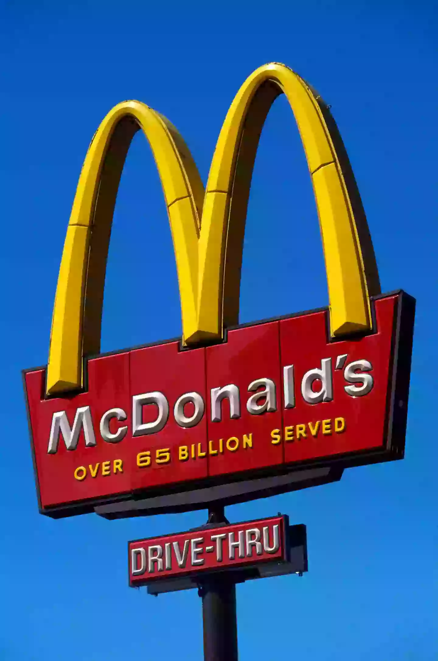
On her website, as reported by The Mirror US, Haller says: “Looking at the positive psychology qualities of red and yellow in relation to the fast food industry, red triggers stimulation, appetite, hunger, it attracts attention. Yellow triggers the feelings of happiness and friendliness.
“When you combine red and yellow it’s about speed, quickness. In, eat and out again.
“Yellow is also the most visible colour in daylight, which is why the McDonald’s M can be seen from a far distance.
“The language of colour is communicated quicker to the brain than words or shapes as they work directly on our feelings and emotions.”
In recent times, McDonald’s has expanded its color palette beyond red and yellow. To cater to environmentally conscious customers, Haller notes that the brand has made changes to its image in certain locations.
She states: “You may have noticed that McDonalds are changing a lot of their store colours to green. Notice the different feeling this gives.
“Green elicits the feelings of nature, natural and environmentally friendly. It’s no longer about rushing in for a quick bite to eat. You can relax, get comfortable, linger over a coffee (almost dare I say, a bit like Starbucks).”
Moreover, TikTok user @vincent.ttcoach explains that these colors significantly impact our minds and bodies, drawing our attention and stimulating hunger.
He mentions that red boosts heart rates, and yellow is particularly striking, making it easily noticeable.
Despite the widespread use of its signature colors, there are a few McDonald’s locations that deviate from the typical palette.
In Sedona, Arizona, there’s a McDonald’s with ‘the blue arches’.
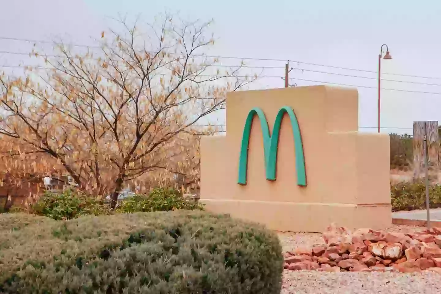
This is the only McDonald’s in the world with this unique color scheme, although the interior remains consistent with other outlets.
The location was established in 1993, and city officials at the time believed the golden arches would clash with Sedona’s scenic red rocks.
To proceed with construction, McDonald’s was required to change its yellow arches to a teal color.
Cari Meyer, Senior Planner of the Department of Community Development for the City of Sedona, told ABC 15: “McDonald’s was built in the early 1990s, right after the city was incorporated in 1989.
“Someone suggested it would be interesting if they did something else than golden arches to fit in with the identity that the city decided to establish.”