There’s an entire process devoted to the proper spacing between characters in typography, known as ‘kerning’. It’s just too bad that these unfortunate wordsmiths haven’t quite grasped it, much to our horror and amusement.
#1. Because one must always be prepared.
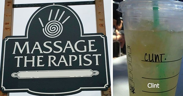
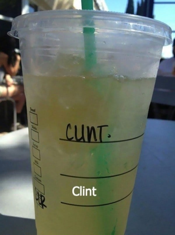
#2. A word of advice: don’t take your kids here.
#3. That’s what she said.
#4. Heaven only knows what the person who put this up was thinking.
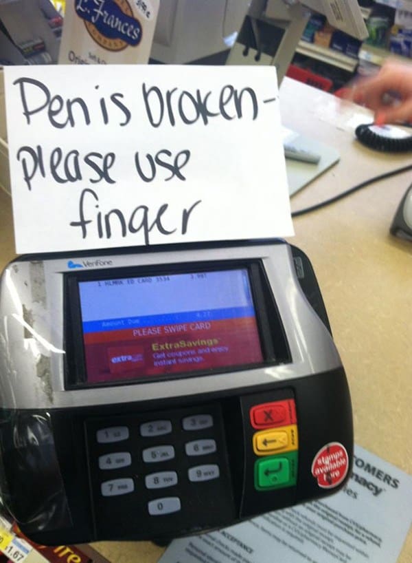
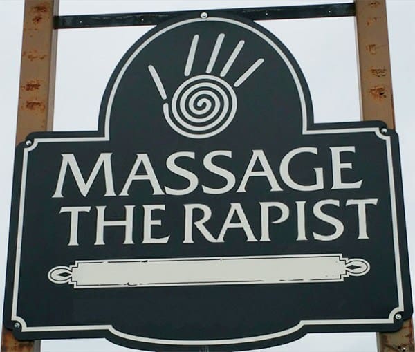
#5. Oh dear.
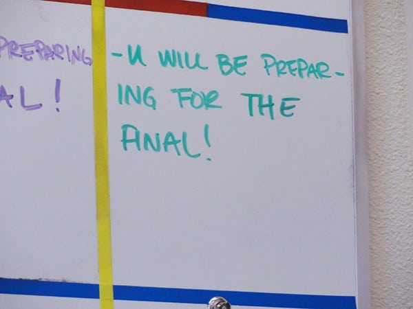
#6. Care for some tart?
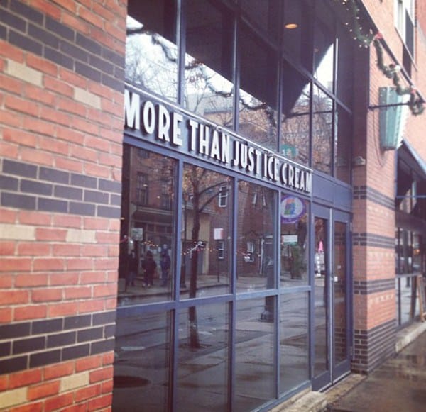
#7. There’s justice in ice cream, yo.
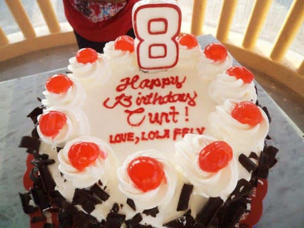
#8. This poor, poor, 8-year-old.
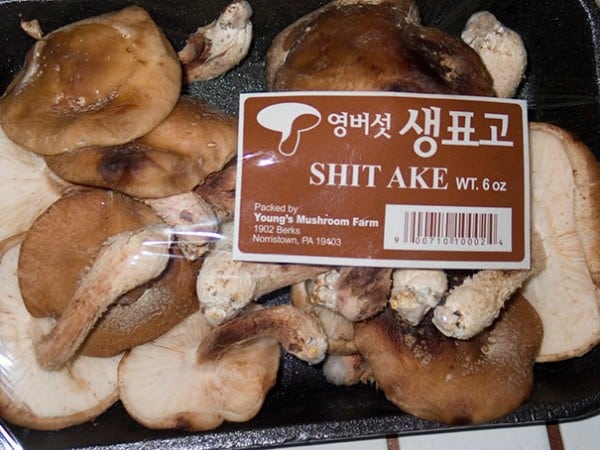
#9. They swear these are ‘shrooms.
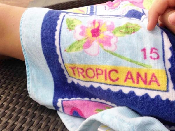
#10. As opposed to Frozen Ana?
#11. Fast and cheap.
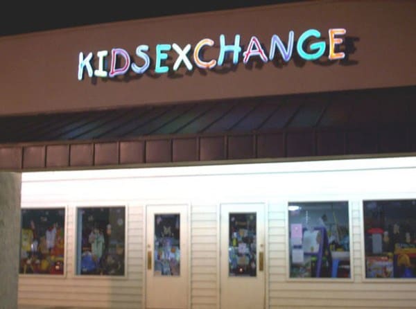
#12. They cater to a very specific demographic, it seems.
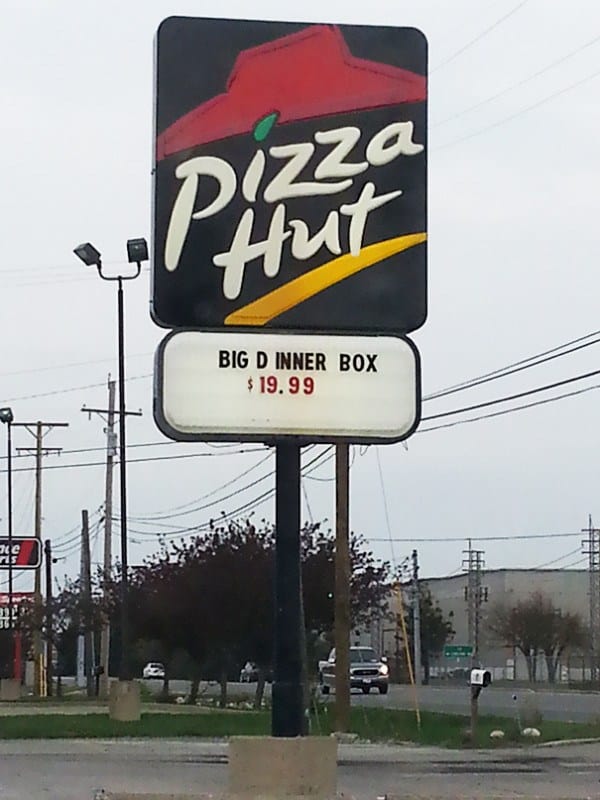
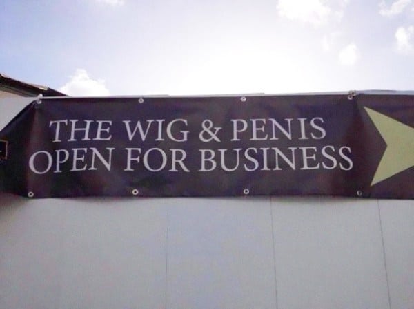
#13. Worst. Thing. EVER.
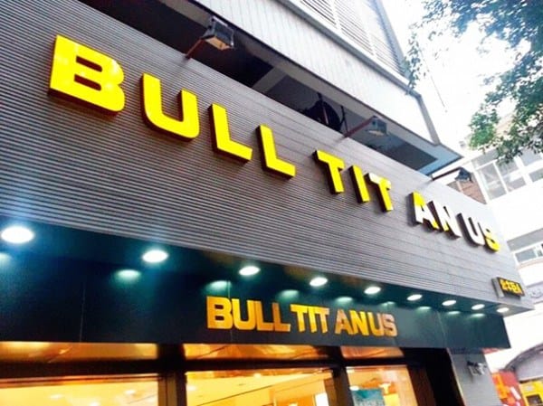
#14. Interesting combination.
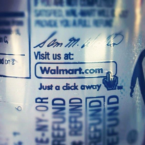
#15. Walmart, what can we say?
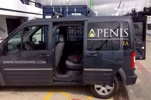
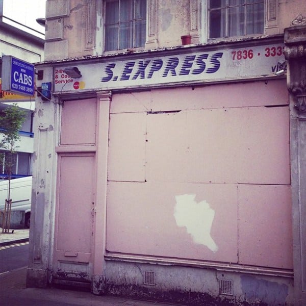
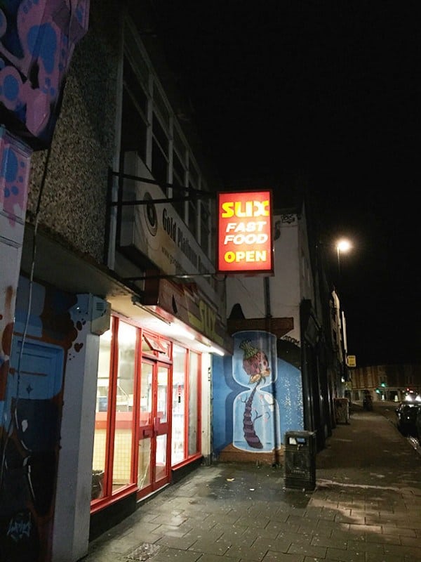
#16. It sucks to be this business.
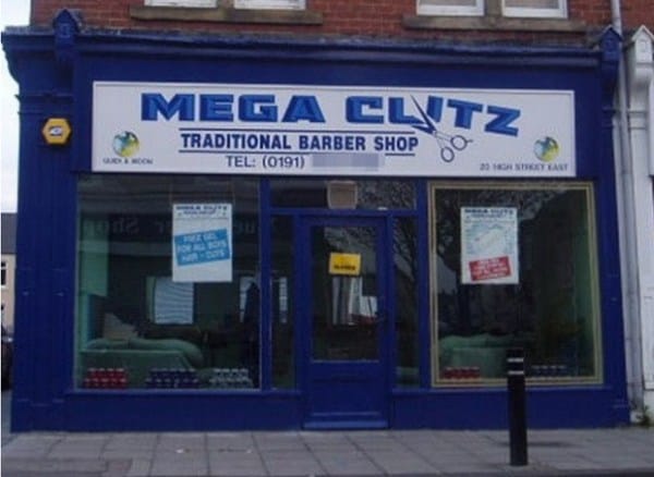
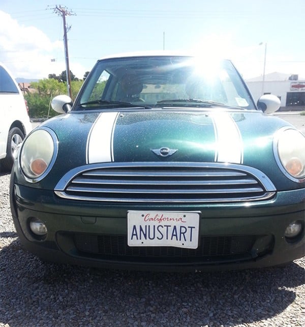
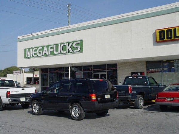
#17. Mega-LOL.
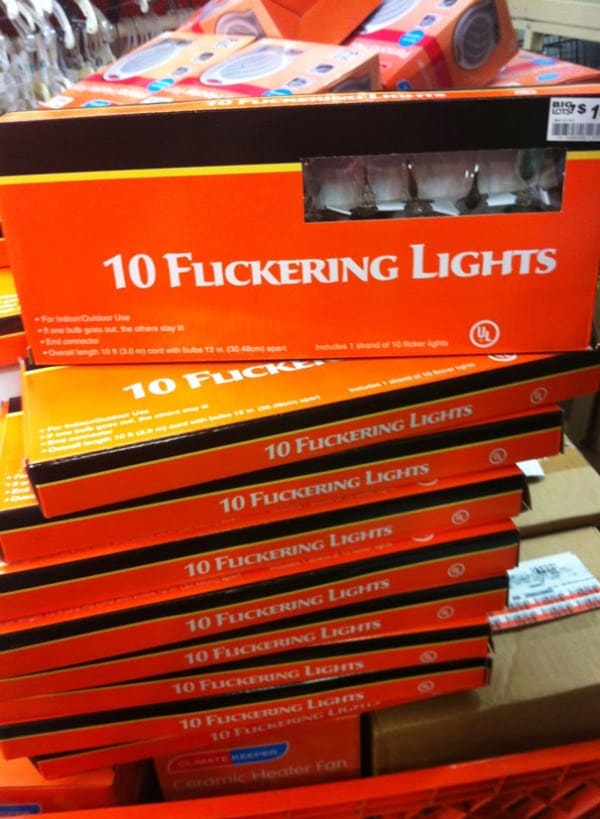
#18. A new font may be in order.
#19. This guy.
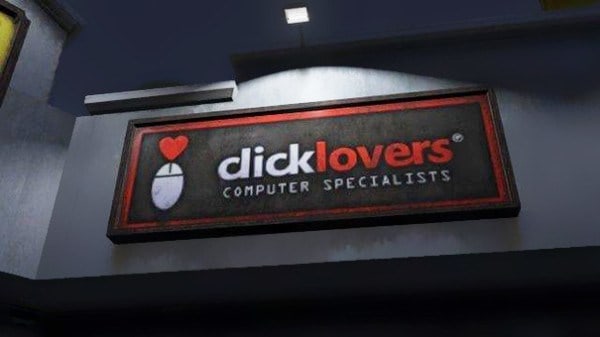
#20. They really love it.
#21. This is so good on so many levels.