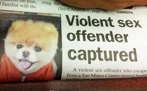
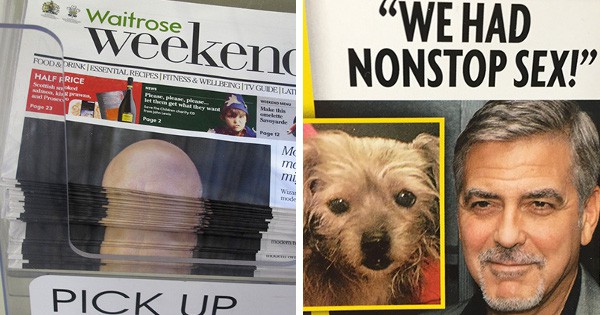
Sometimes, editors don’t totally think through their layout ideas of headlines and images. This is called tombstoning, and they’re downright hilarious.
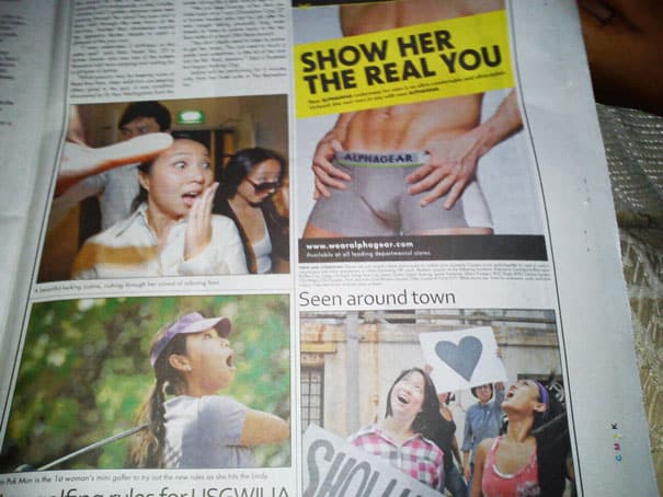
#1. This lady is shocked by the sight of the “real you”.
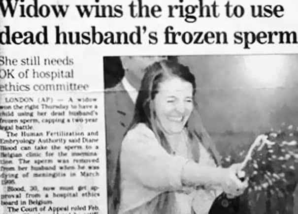
#2. Look at this lady celebrating! Oh wait, different stories.
#3. Always double-check your cover photo, especially if you edit “Where” magazine.
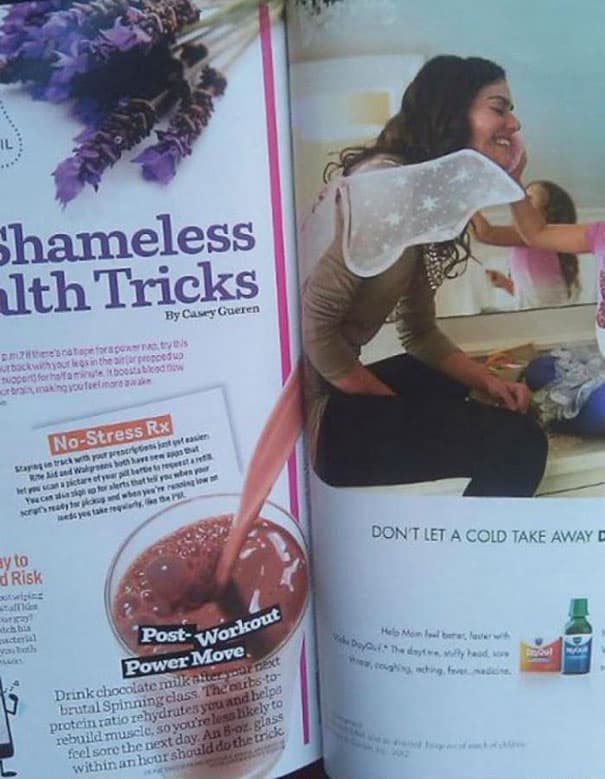
#4. That really is a shameless health trick.
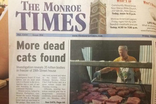
#5. Hold on, WHERE were those cats found?!
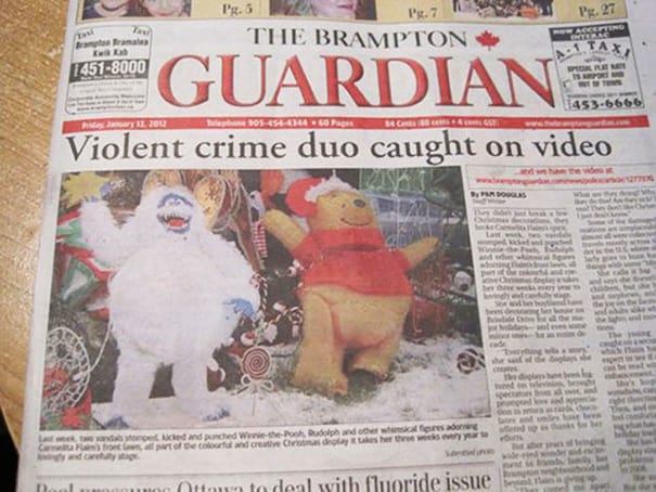
#6. Winnie the Pooh just can’t be stopped these days.
#7. Oops.
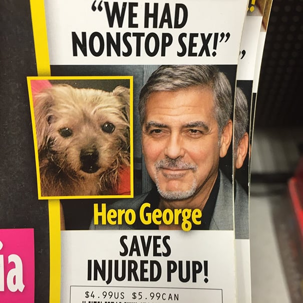
#8. George, you minx.
#9. This is why you don’t put a bald man on the front page.
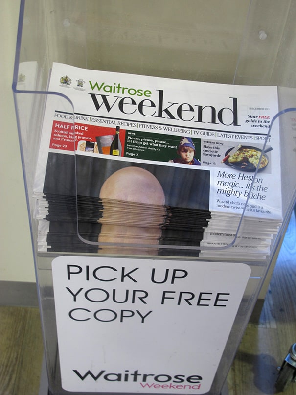
#10. Who okayed this?!
#11. Thank goodness this guy is behind bars at last.
